
Visual Brand Design
Background
As a freelance designer, I often take on branding projects for various clients. Cashmere & Copper is a local Salt Lake City home and lifestyle blog, and I designed their 2018 rebrand.
1 | Gather Information About Existing Brand
These are a few of the questions I talk through with the client before beginning to do any design work:
What is the mood of the brand?
What matters most to you about your brand?
What are you looking for in a redesign/why are you redesigning?
What is the brand’s inspiration?
How do you envision the brand to look if it were a person?
What are your viewers/users attached to about the brand?
What is the content like that your viewers/users love most?
From these questions, I have a pretty good understanding of the brand and how the client pictures the future of their brand. The clients shared their vision for the brand mood during this step. This mood guided the creation of the mood board in the following step.
Autumn, boots, walking in Amsterdam, leaves falling, long wavy hair, cozy sweater, carrying fresh flowers
Cold, gray day, candles, cozy at home, comfy lounge set, clean fresh decor
Cooking in the kitchen, comfy sweater, surrounded by loved ones, clean white decor
2 | Create a Brand Mood Board
My favorite way to create a mood board is through collaboration and shared ideas with the client. For this project, I created a shared Pinterest board that both the client and I added pins to that reflected the above brand mood. I encouraged her to pin away and choose things that best show off Cashmere & Copper. I had her talk me through some of her favorites and explain why she believes they fit the brand. The final board reflects the pins that best fit the future look of Cashmere & Copper.
Final Cashmere & Copper mood board.
3 | Sketch First Logo Ideas
I always like to start on pen and paper with a new logo design. Using inspiration from their previous logo, the mood board, and ideas they had pinned, I sketched logo drafts.
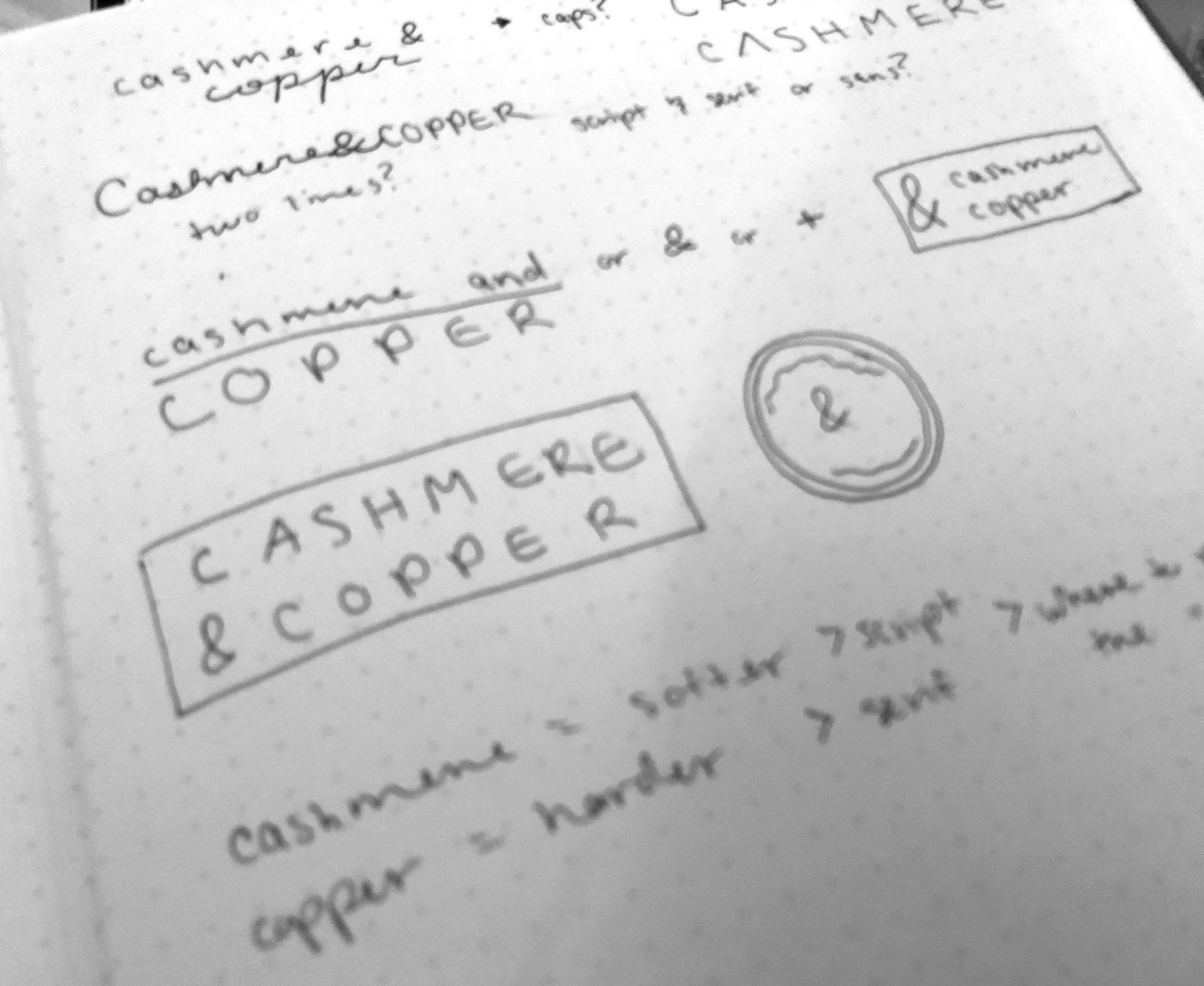
Initial logo sketches for Cashmere & Copper.
4 | Design the New Logo
After presenting some of the sketched ideas and talking through likes and dislikes, I created digital logo drafts. It was important that I stuck with black and white only since it’s all about the meaning behind the logo and the visual design. It’s too early to get caught up on colors, textures, and final mockups.
In this step, we explored possible typefaces, layouts, styles, weights, and shapes. We went through multiple rounds of feedback before landing on the final design. I prefer to be in constant communication with the client because it allows for quick feedback and iteration.
I’ve learned to iterate quickly, discover fails even faster, and remove immediate attachment to any designs.
Options from various stages in the logo design process where different shapes, fonts, styles, and layouts were presented.
5 | Design the Brand Mark
After choosing the final logo design, we moved on to the creation of a brand mark that would complement the logo. It’s important that a logo is versatile and flexible so that it can be used in all necessary situations. Sometimes it is important to have a brand mark that can stand-alone when the full logo is not needed or cannot fit. A brand mark has multiple functional use cases.
To create the brand mark design, we iterated through the same process we used to create the final logo.
Options from various stages in the brand mark design process.
6 | Choose the Brand’s Colors & Textures
Once the logo and brand mark had been designed, it was time to talk about colors and textures. We referenced the original mood board to work through this step. I pulled color and texture options from the board, experimented with various palette options, and discussed where the colors would be used when displayed. They needed to be flexible, represent the mood, work well with the logo, help tell the brand’s story, and relate to the viewer/user.
Since Cashmere & Copper is an online home and lifestyle blog, more colors and textures were needed (compared to the typical brand) to be used throughout posts and on their social media platforms. They wanted multiple options to use since they are posting daily content. It is important to create a cohesive brand, but they wanted colors and textures that could serve as memorable accents.
Final Cashmere & Copper color palette.
7 | Create and Educate on Brand Guidelines
The final step in my brand design process is to create the brand guidelines booklet to help the client best integrate the brand design throughout the company. The guidelines include color codes, various logo usage ideas, the name and style of the chosen fonts, brand mark variations, and social icons.
When distributing the final files, I explained how the designs could be used and shared some ideas to integrate the different textures and colors throughout the brand’s online presence. Cashmere & Copper will continue to develop over time as they begin to use the new designs and share the visuals with their viewers/users.

Final Cashmere & Copper logo design.

Final Cashmere & Copper brand mark design shown in various color options for social media usage.